PROJECT
Pfizer
Reimagining a Global Healthcare Leader.
READ MORE
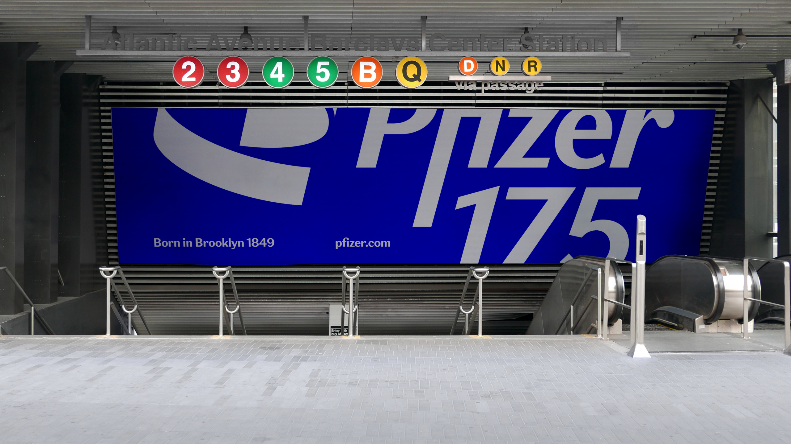
As Pfizer celebrated its 175th anniversary, the pharmaceutical giant seized an unprecedented opportunity to redefine its brand identity. Leveraging the global attention garnered during the Covid-19 vaccine development, the company embarked on a comprehensive rebranding initiative that would position it at the forefront of modern healthcare communication.
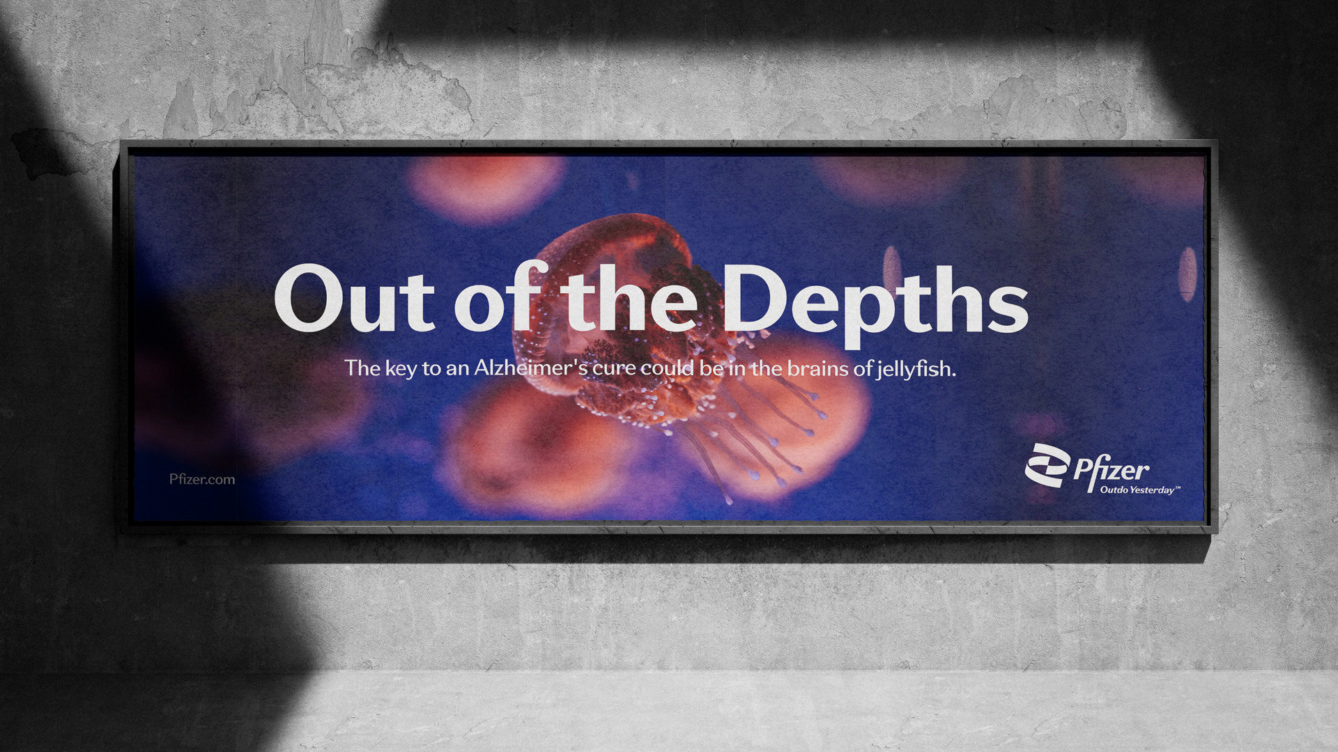
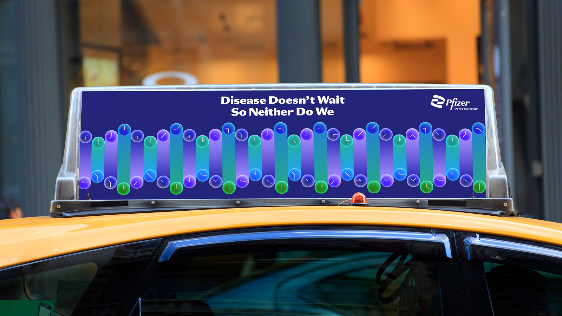
The redesign was meticulously crafted with digital-first principles, prioritizing accessibility and flexibility across Pfizer's diverse product portfolio. This holistic approach transformed every touchpoint of the Pfizer brand ecosystem, creating a unified yet adaptable visual language.
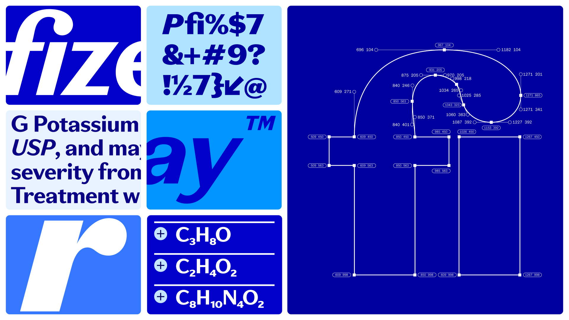
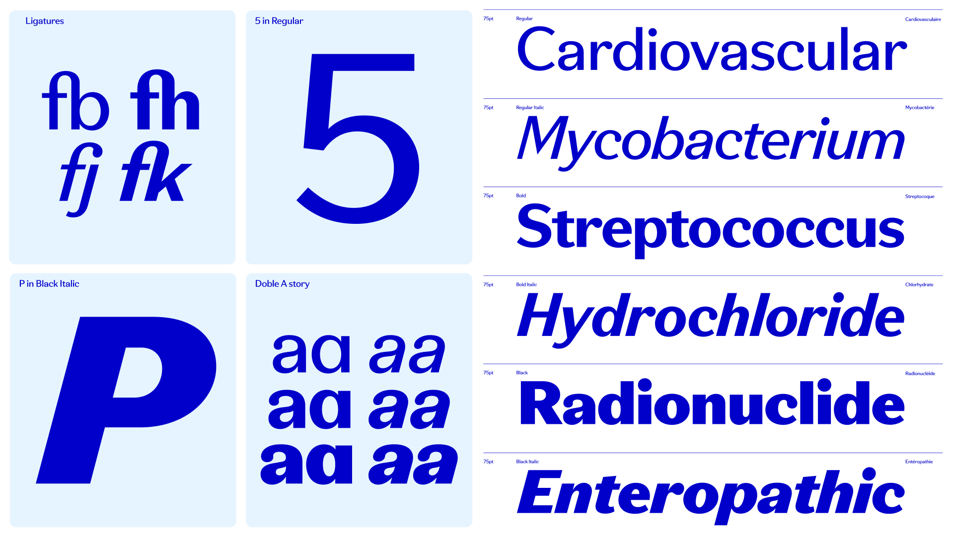
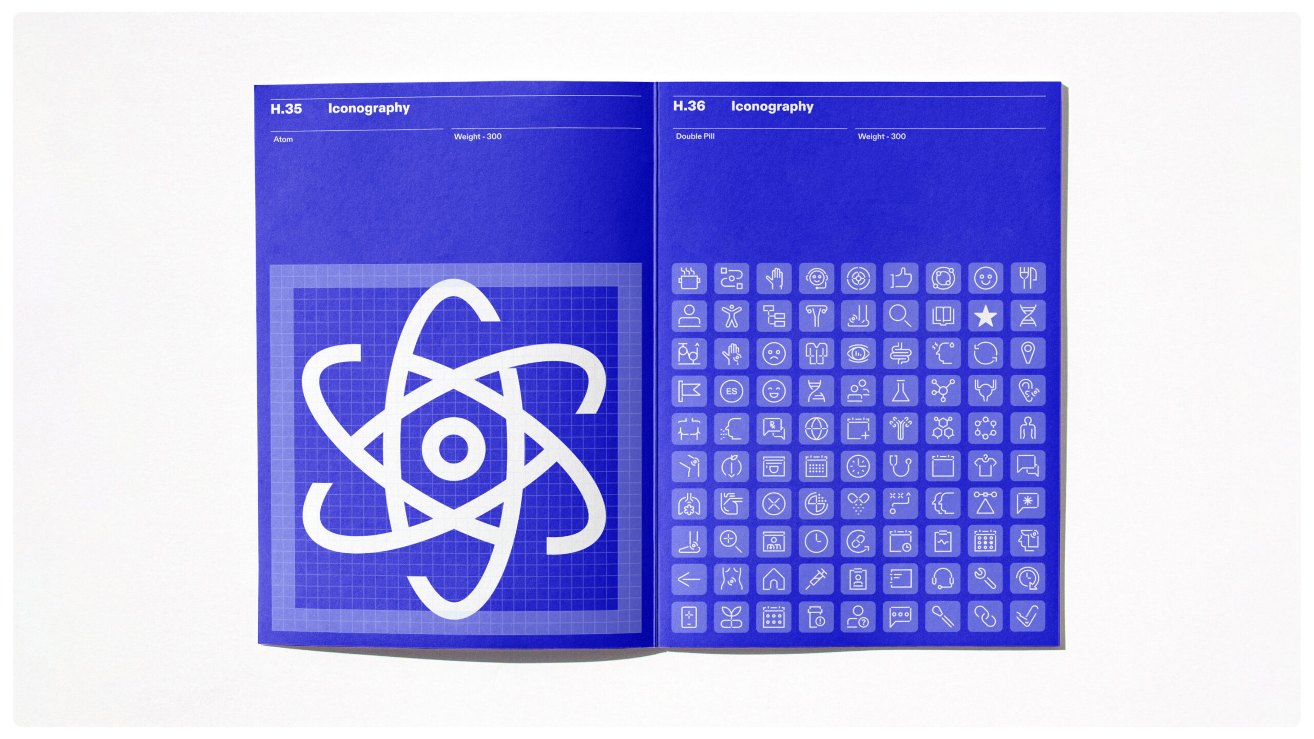
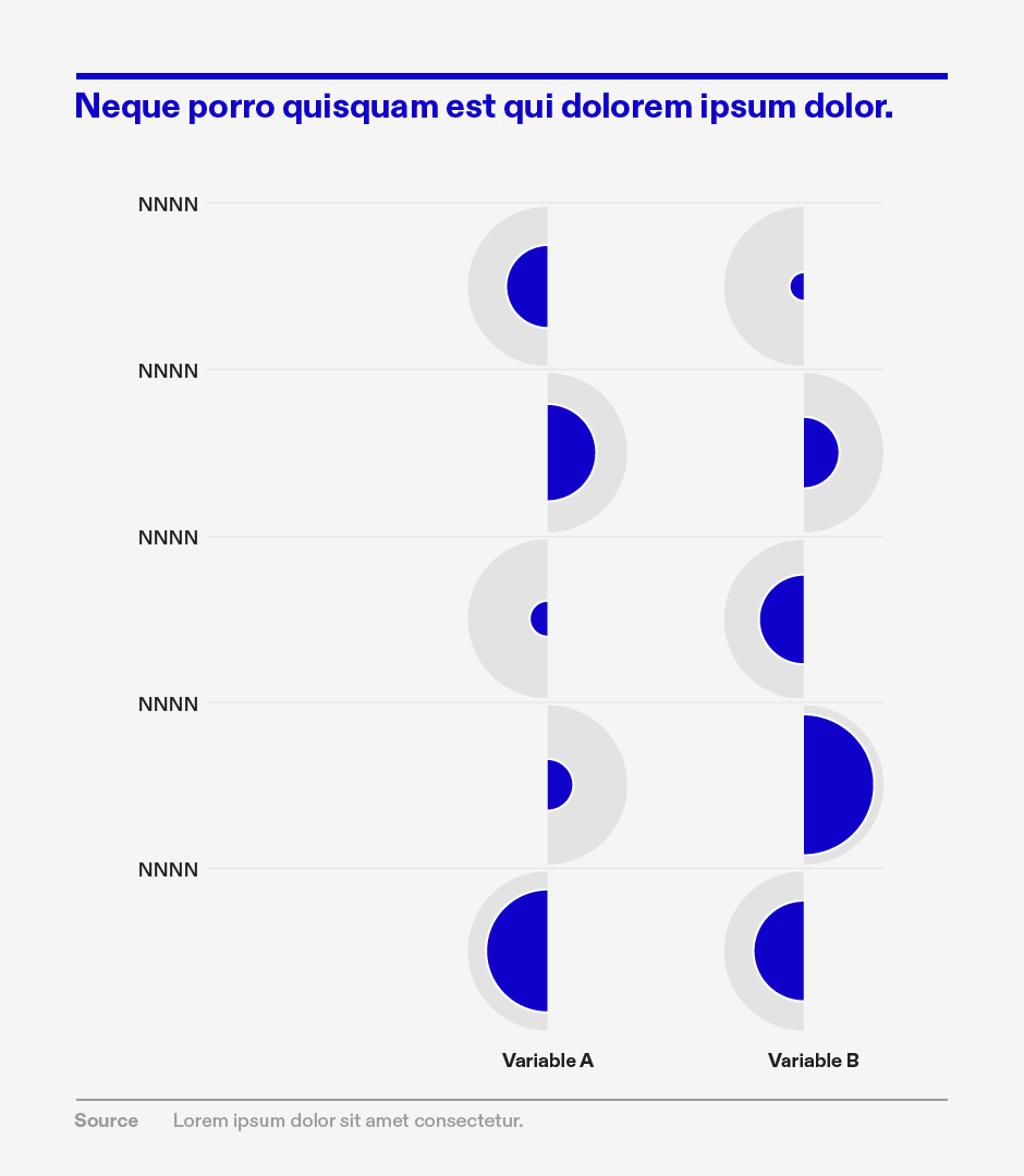
The visual identity centered on a new typeface derived directly from the Pfizer wordmark, ensuring typographic consistency throughout their communications. A sophisticated color palette was developed to enable seamless application across communications, digital platforms, and data visualizations. The company also introduced modular illustration systems that empower employees across the organization to create consistent, on-brand visual content.
Digital design principles were reimagined with a focus on universal layout principles specifically developed for web platforms. The approach prioritized screen-based interactions and user experience, creating flexible design systems capable of accommodating the complexity of a multinational healthcare brand.
This rebrand represented more than a cosmetic update—it was a strategic reimagining of how Pfizer communicates its mission, values, and scientific innovation in a rapidly evolving digital landscape. By thoughtfully integrating design, technology, and brand strategy, Pfizer created a visual identity that reflects its global leadership and commitment to innovation.
CREDITS
AGENCY: PENTAGRAM
TYPEFACE: MCKL TYPE
AGENCY: PENTAGRAM
TYPEFACE: MCKL TYPE
