PROJECT
Android
Bridging Technology and Community.
READ MORE
With over 2.4 billion users globally, Android has strategically reimagined its brand identity to reinforce its connection with Google while preserving its deep roots in the developer community. Throughout its history, the brand has undergone significant transformations, yet one element remained consistently iconic: the Android mascot.
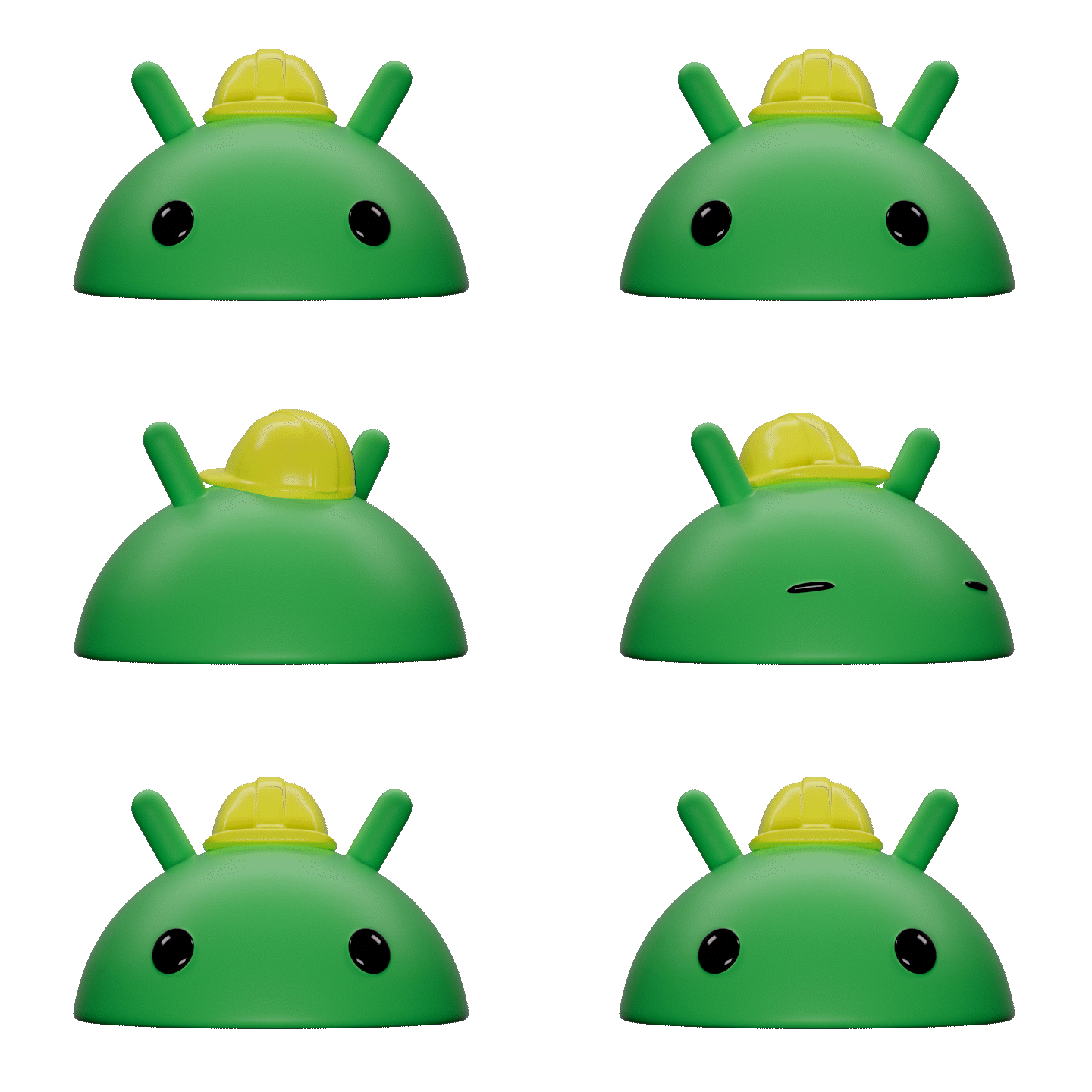
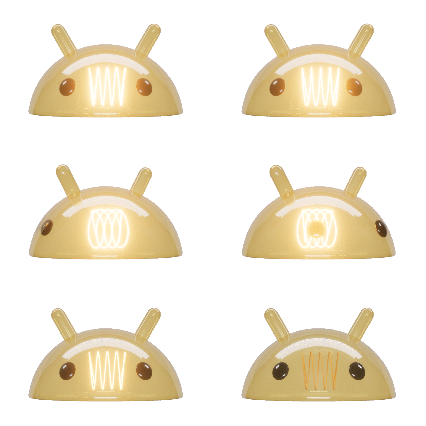
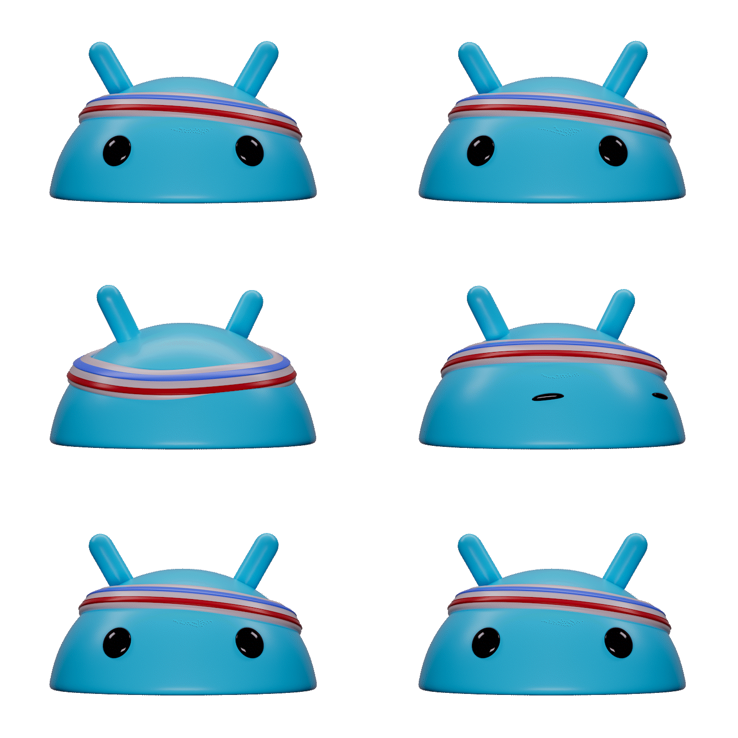
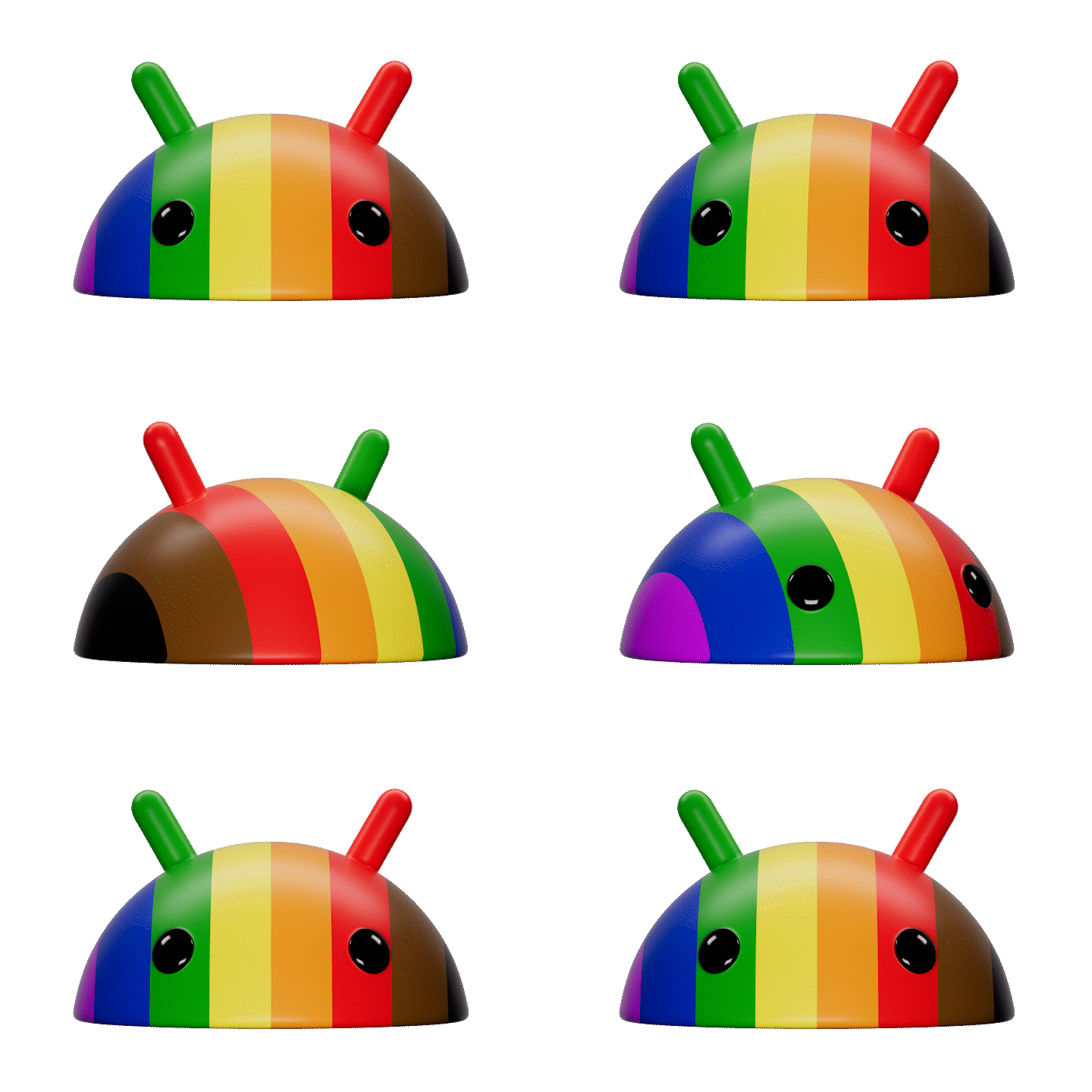
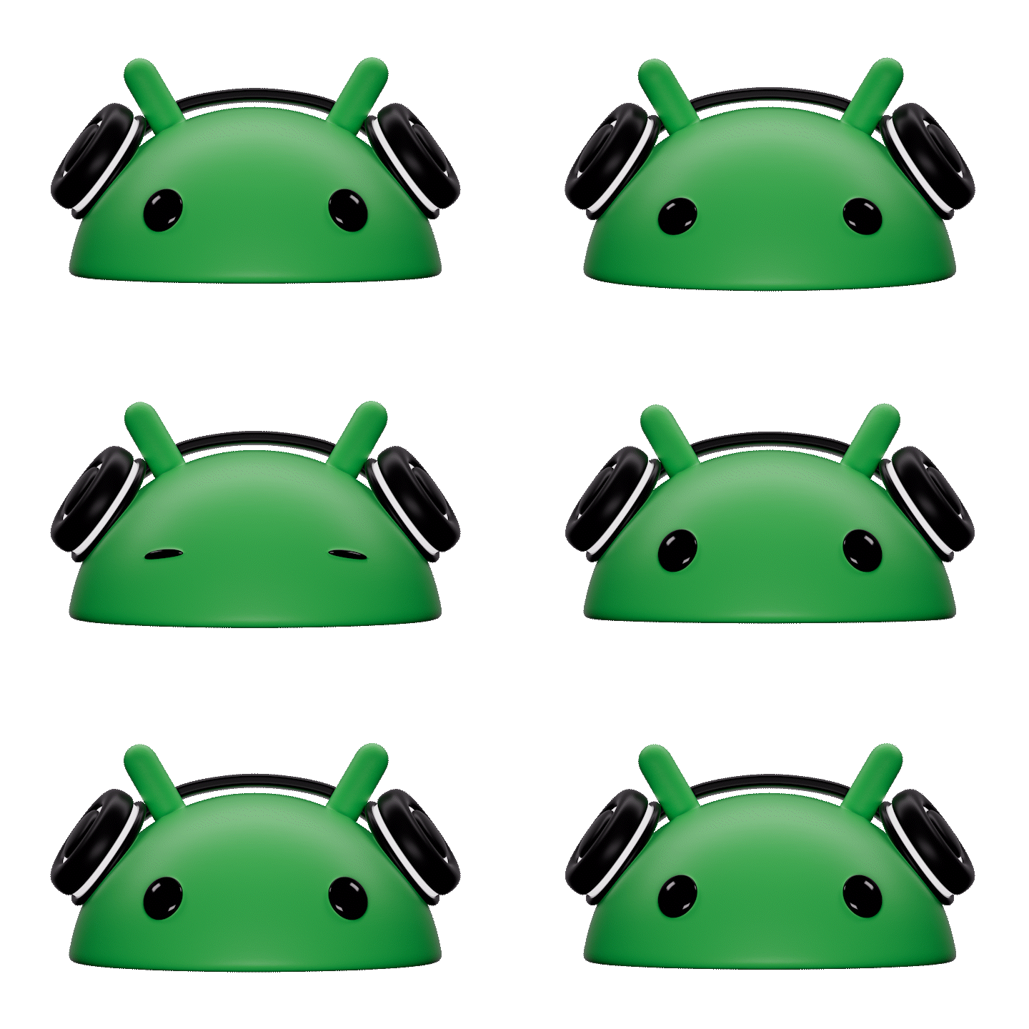
In recent years, the mascot experienced a controversial metamorphosis. The original Android character was dramatically simplified, reduced to just a head and rebranded as "the bug" - a change that sparked considerable pushback from the passionate developer community that has been integral to Android's narrative.
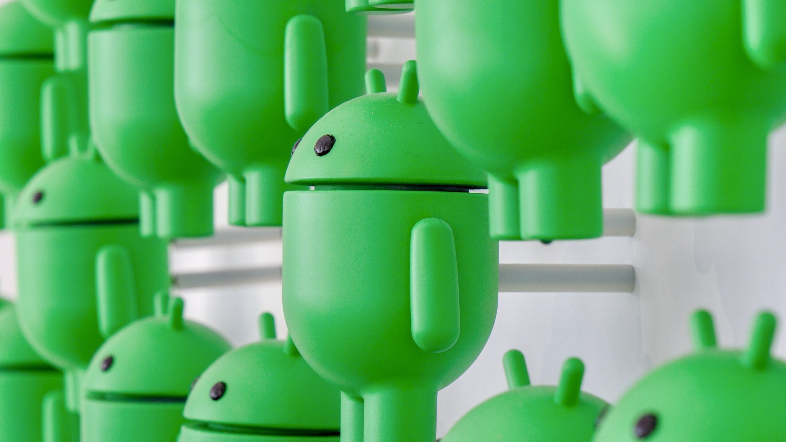
The recent rebranding represented a nuanced opportunity to reconcile multiple design objectives. The new approach introduces a dynamic "Droid" that can seamlessly transition between a simplified head representation and a full-bodied form. This versatile mascot not only modernizes the Android brand for digital interfaces but also strengthens its visual connection to Google.
The brand's conceptual foundation now portrays Android as an intelligent, ambient technology layer that activates contextually. This "active layer" concept emphasizes adaptability, intelligently responding to user needs and highlighting critical moments of interaction. Complementing this vision, a newly optimized typeface enhances accessibility while maintaining the brand's commitment to visual diversity.
By balancing technological innovation with community sensitivity, Android has crafted a brand identity that feels both progressive and familiar.
CREDITS
AGENCY: R/GA
DROID RENDERS: DE-YAN
TYPEFACE: ARILLATYPE
AGENCY: R/GA
DROID RENDERS: DE-YAN
TYPEFACE: ARILLATYPE
