PROJECT
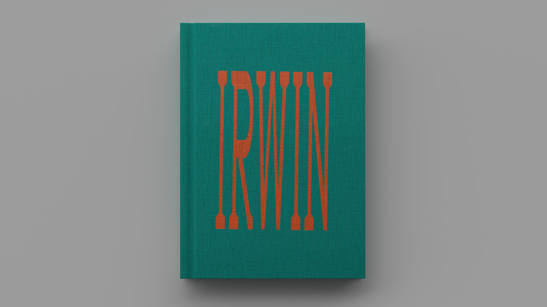
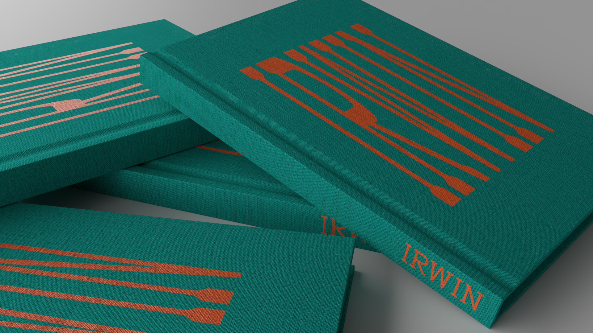

Irwin
Irwin
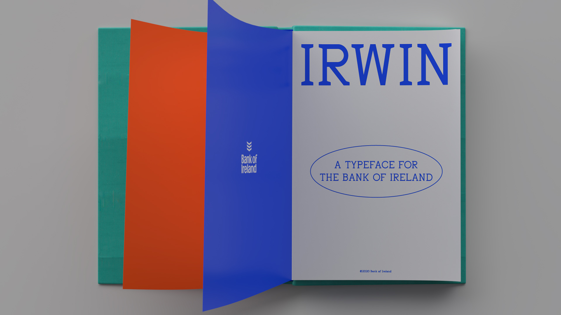
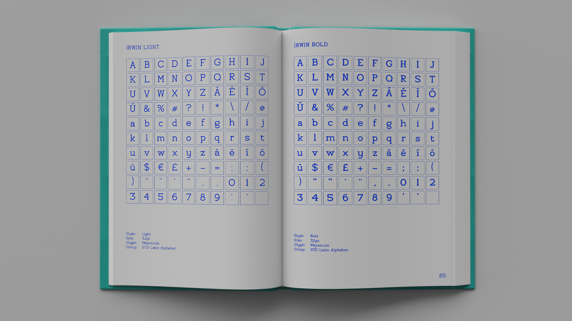
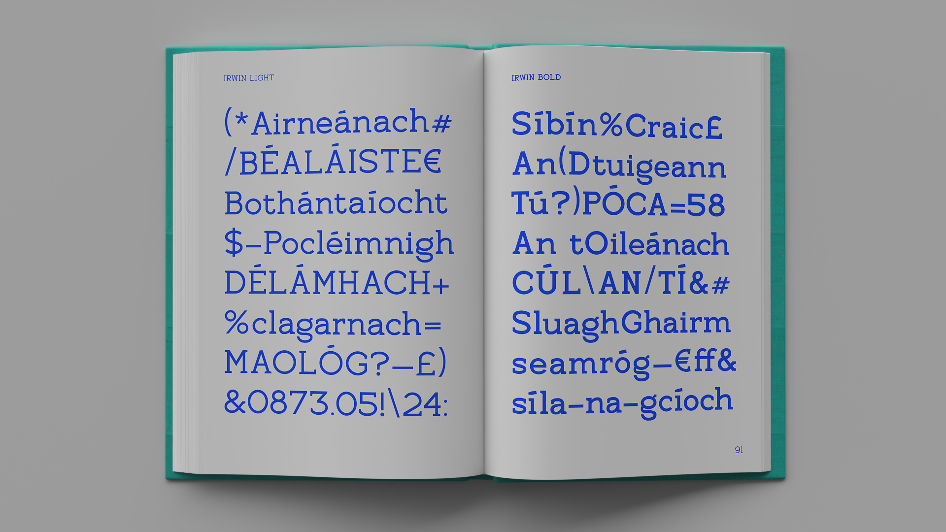
A new voice for the Bank of Ireland. Commisioned to design, build and launch a brand new bespoke typeface for the Bank of Ireland, the typeface needed to be applied across both digital and physical applications from forms to product to advertising.
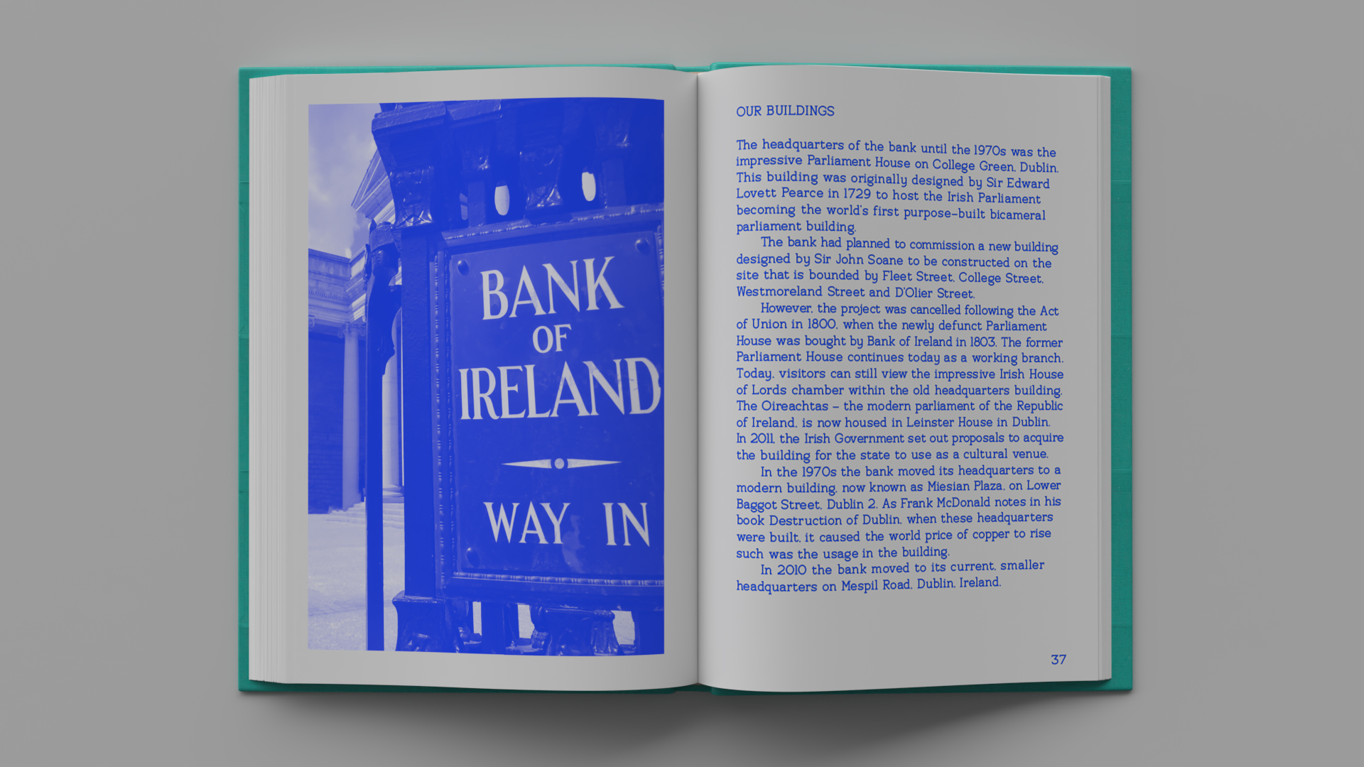
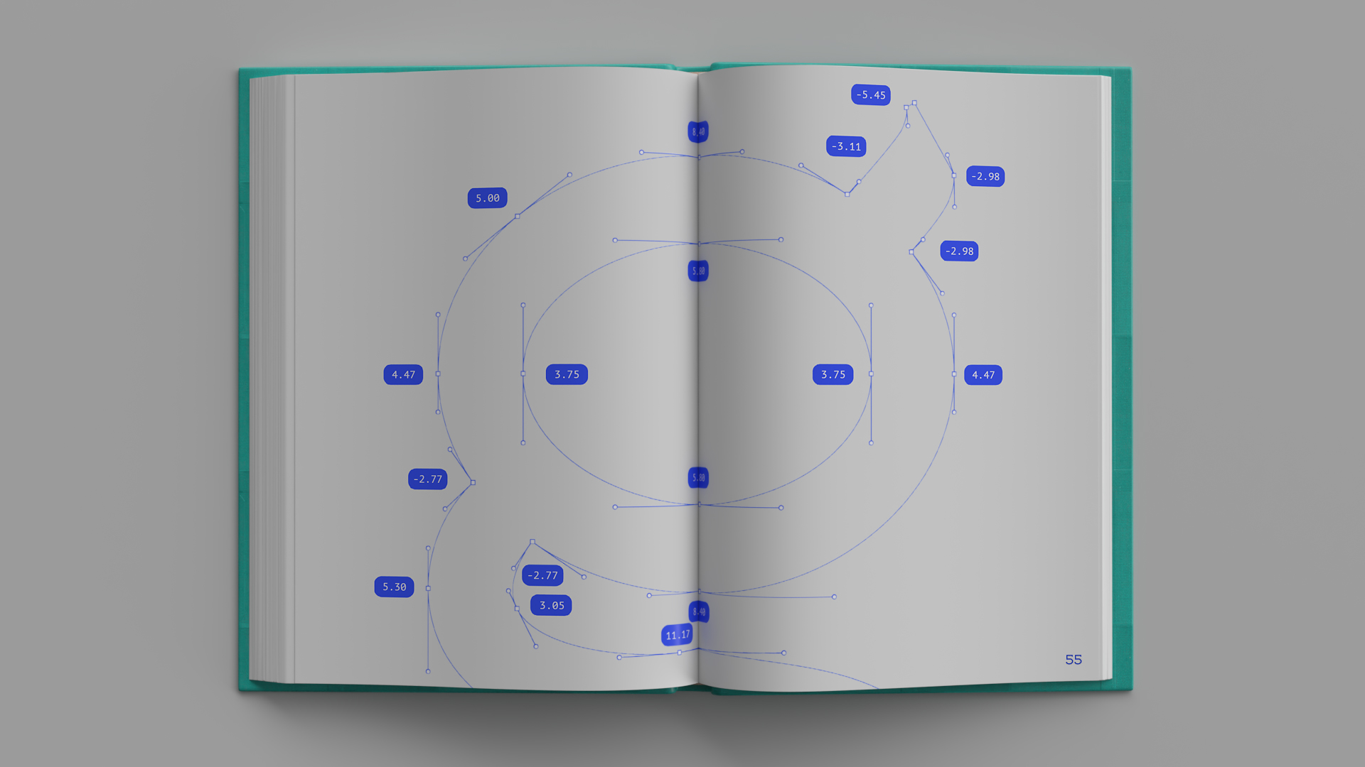
The reference draws on a mix of forms from the idiosyncratic letter widths of the original signage outside the banks headquarters in Dublin as well as the flared logo that symbolises a wheatcheif. The result is a humanist serif that creates a variation in texture during use, this warm expression projects a more friendly message from the bank.
A new voice for the Bank of Ireland. Commisioned by Landor to design, build and launch a brand new bespoke typeface for the Bank of Ireland, the typeface needed to be applied across both digital and physical applications from forms to product to advertising.
The reference draws on a mix of forms from the idiosyncratic letter widths of the original signage outside the banks headquarters in Dublin as well as the flared logo that symbolises a wheatcheif. The result is a humanist serif that creates a variation in texture during use, this warm expression projects a more friendly message from the bank.
Agency: Landor
Agency: Landor